
ADA signage design
Compliance, drawn in
ADA signage is the part of the sign code that exists for people who can't rely on a printed arrow read across a lobby. The 2010 ADA Standards spell out exactly what a permanent room or space sign has to do, and getting any one requirement wrong fails the sign at inspection.
We draw the compliant set. We don't make the signs, we make the drawings that tell a fabricator exactly which signs are tactile, what the characters and braille have to be, and where every one mounts. When the inspector walks the building, the signs match the code because the code was in the drawing first. And ADA rarely stands alone: nearly every compliant set we draw is part of a wayfinding system, designed together so the same signs do both jobs. It's part of our broader signage design work.
Tactile characters
Raised, sans serif, uppercase.
Grade 2 braille
Contracted, domed dots, below the last line of text.
Contrast and finish
High contrast in a non-glare finish.
Mounting height and location
Baseline 48 to 60 inches off the floor, on the latch side of the door.




The compliant set
- Compliant sign types drawn with character height, finish, and braille spec called out
- A location plan keyed to each door and room, so every required sign is accounted for
- A message schedule that fixes the wording and the room numbering across the whole building



Who we work with


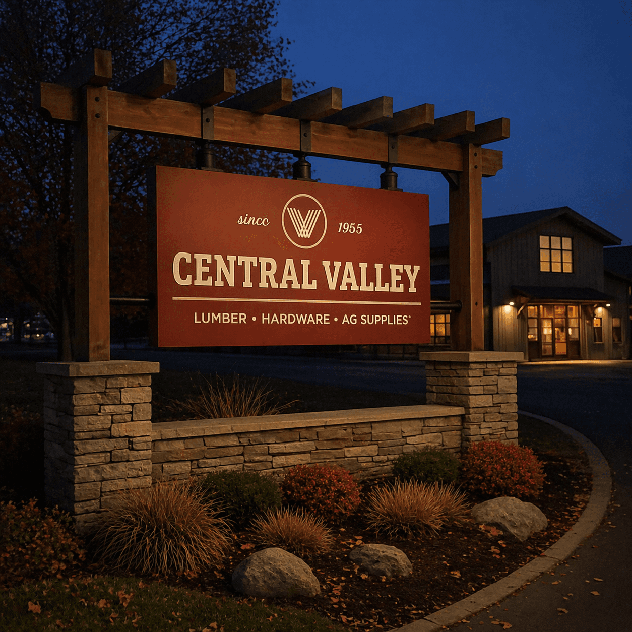
Sign companies
White-label design and drawings for busy shops. We draw, you fabricate, and your client never knows we were involved.


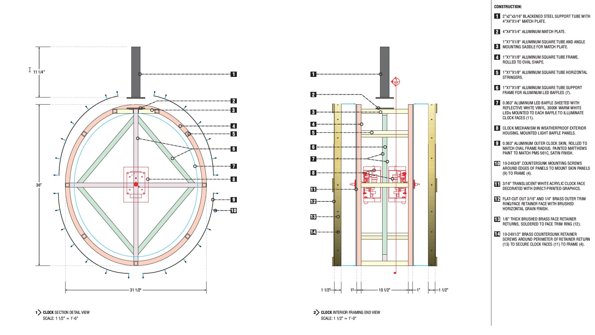
Architects & designers
Signage and wayfinding documented to sit inside your set, on your schedule, drawn to the standard your drawings hold.

Facilities & property teams
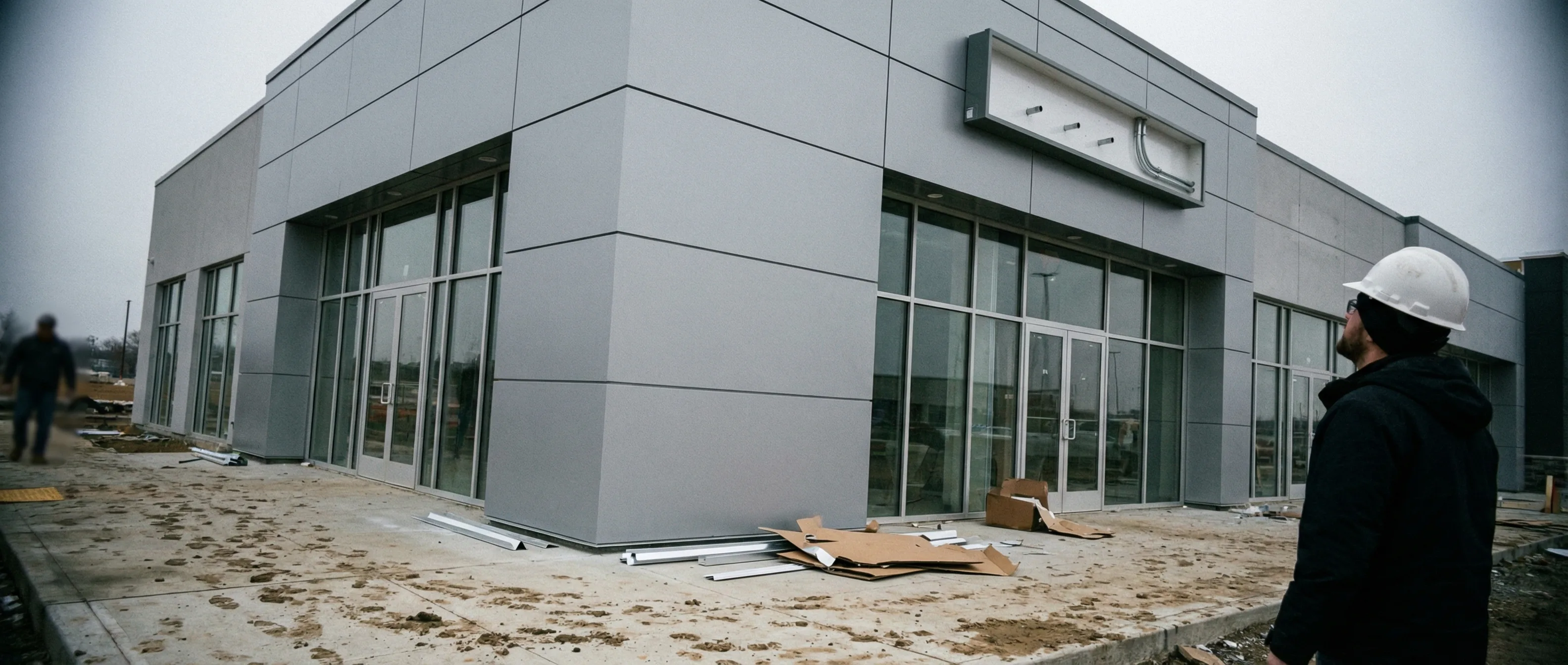
Wayfinding and sign standards for campuses, portfolios, and multi-building sites that have outgrown the signs they started with.

Brands & retailers
Sign programs that hold the brand across every location and bend to each local code, without ever losing the look you built.
ADA signage, answered

Didn't find your question? Ask us directly — straight answers, no runaround.
- What makes a sign ADA compliant?
- Five things at once: raised tactile characters, grade 2 braille, high contrast, a non-glare finish, and the right mounting height and location. A permanent room sign has to satisfy every one of them. Miss a single requirement, like a finish that's too glossy or text mounted an inch too high, and the sign isn't compliant even if the other four are perfect.
- What are the braille and tactile requirements?
- Tactile characters are raised a minimum of 1/32 inch, uppercase, in a sans serif font, between 5/8 inch and 2 inches tall. Braille is contracted grade 2, placed at least 3/8 inch below the last line of text, with domed dots at the spacing the ADA standard specifies. Both have to appear on any sign that identifies a permanent room or space, like restrooms, stairwells, and numbered offices.
- What's the correct mounting height?
- The baseline of the lowest tactile character sits 48 inches above the floor, and the top of the highest character sits no more than 60 inches. The sign goes on the wall on the latch side of the door, not on the door itself, so someone can read it without standing in the path of the swing. Where there's no wall on the latch side, the standard gives an alternate location and we draw to it.
- Do you provide the full compliant drawing set?
- Yes. We deliver the compliant sign types, a location plan that catches every required sign, and a message schedule that locks the wording and room numbers. It's a set a fabricator can build straight from and an inspector can check against, and it's usually drawn as part of a larger wayfinding system rather than on its own.
Read more



Good signage
starts with a conversation.
Every project is different. Let’s talk about yours.