Sight Lines Do More Work Than Signs
Every wayfinding job we get called in to fix starts the same way... Someone in a lobby, arms crossed, "we need more signs." A person got lost, so clearly the answer is a bigger arrow.
THE CALL
Every wayfinding job we get called in to fix starts the same way... Someone in a lobby, arms crossed, "we need more signs." A person got lost, so clearly the answer is a bigger arrow. But after thirty years of this we can tell you most of the time the sign wasn't the problem. The building was. The hallway was. The intersection where two corridors look identical and the visitor has to stop dead, read, process, and hope.
We design signs for a living. And we're telling you a clear sight line down a well-designed corridor will outperform the best sign we've ever made. Not a knock on signage. Just how brains work. People orient spatially first and read text second. By the time someone's squinting at your directional, the building has already failed them.
BEFORE ANYONE READS ANYTHING
When you walk into a space your brain does something before you look at a word. It scans. Room geometry, corridor depth, where the light is, where people are. Two seconds. And in those two seconds your subconscious has already picked a direction. You've decided what's a path and what's a wall.
No sign did that.
I watched a woman walk into a medical office lobby last year. She was a new patient, this was her first visit. Double-height atrium, glass curtain wall on the far side, wide corridor with warm downlighting opening toward reception. She never looked at the directory. Never read the directional sign that I designed and spent real time on. No, she walked straight to reception because the architecture pulled her there. Light, width, activity. The sign was backup she didn't need.
That's a space success, not a sign failure, and it's the goal. Not "no signs," you'll always need room IDs and ADA and regulatory. The goal is a building where the space carries the navigation load and signs reinforce rather than compensate.
BAD BUILDINGS, GOOD SIGNS, BAD OUTCOMES
Good airport terminal. Forget the signs. Long unbroken sight line from the moment you clear security. You can see gates, see the concourse curving, your brain knows the path continues. No sign needed because you can see where you're going.
Bad hospital. Main entrance dumps you at a T-intersection. Both directions identical. Same floor, same ceiling, same lighting, same nothing. So you stop. Find a beige panel. "Radiology / Cardiology / Outpatient Services" in 1-inch Helvetica with an arrow. Now you've got a cognitive task while you're stressed, in pain, or overwhelmed by being in a hospital at all. A clear sight line has no language barrier. A sign in English with an arrow has a massive one.
We're not blaming architects. They're juggling structure, mechanical, code, budgets, and a hundred things that have nothing to do with wayfinding. The real issue is these conversations almost always happen after the floor plan is locked. By the time we show up, the spatial decisions are baked.
THE SPATIAL TOOLKIT
What actually moves the needle, pulled from projects and buildings we've studied over the years:
- Let people see their destination from the start. Can they see the staircase from the entrance? A balcony edge, a mezzanine? When the destination is visible the navigation problem mostly solves itself.
- Make primary paths feel different from secondary ones. Wider, brighter, taller ceilings. We've walked buildings where every corridor is identical and people wander into back-of-house because the building made it indistinguishable from front-of-house.
- Put something at the end of corridors. Window. Feature wall. View outside. Pulls you forward, creates a landmark. "I walked toward the big window and turned left" is a navigation instruction that cost zero signage.
- Use thresholds. Change in flooring, ceiling height, light temperature. Tells people they've crossed into a new zone without a word. We've spent hours on observation walks, sitting on benches with coffee and a notebook like weirdos, and the pattern is consistent. When spatial cues are strong enough, people almost never look up at signs.
- Use light on purpose. Brighter at the end of a corridor pulls forward. Warmer in a seating area signals stay. We worked with a lighting designer on a senior living facility who mapped illumination to circulation paths. Residents who struggled with signage navigated confidently because the light guided them. Retail figured this out decades ago.
- Don't underestimate social wayfinding. People walk toward people. A reception desk visible from the entrance does more than most sign packages. We've seen lobbies where reception was hidden around a corner and the proposed fix was a sign when the real fix was moving the desk.
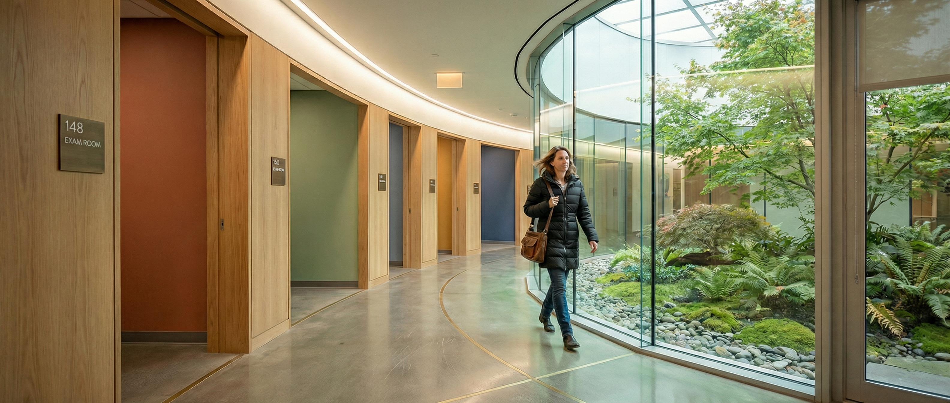
THE CURVED CORRIDOR
Medical office building, few years back. Architect did something we don't see enough. Main corridor had a gentle curve. Inside, continuous window wall onto a courtyard. Outside, exam rooms in alcoves with warm wood surrounds, each a different accent color. Good light, directional pattern in the floor.
Our original sign package had room IDs, directionals, a you-are-here map, overhead signs. After walking the space during construction we cut it in half. Room IDs stayed. Everything else got killed. The curve was the direction. The garden was the landmark. The colored alcoves were the zones.
Client saved money. Walls stayed clean. Post-occupancy, almost nobody had trouble.
That's the version of this work we're proudest of. Not because of great signs. Because we recognized where they weren't needed. Which took a long time to learn. Earlier in our careers we would've installed the full package because more signs meant more scope. Took years to get comfortable with the idea that sometimes the most valuable thing we can do is less.
SIGNS ARE THE LAST SENTENCE
Wayfinding is spatial before it's graphic. The sign is the last sentence of an argument that starts with the floor plan. If the argument is clear, the sign is a quiet confirmation. If it's confused, the sign is shouting over noise.
We'd love to see these conversations happen earlier. During schematic design, when corridors are being routed and sight lines are being built or accidentally wrecked. By the time someone calls us, the big moves are done. We can refine. We can't redesign a lobby.
Start with what people can see. The signs will sort themselves out.
Good signage starts with a conversation.
Every project is different. Let’s talk about yours.